01. Card-Based Design
- Examples: Pinterest, Trello
Description: Information is presented in "cards" that contain different types of content like images, text, or links. The card layout is flexible and visually engaging.
Benefits: Easy to scan, responsive, and adaptable to different devices.
- Tip: Design each card as a standalone piece of information, with clear interactive elements. Utilize whitespace and hierarchy for better readability.

02. Flat Design
- Examples: Microsoft's Metro UI, Google Material Design
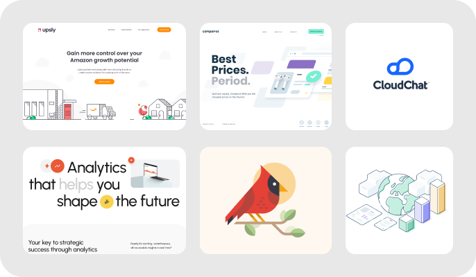
Description: Prioritizes simplicity, using flat, two-dimensional elements without shadows or gradients, often paired with bold colors.
Benefits: Clean, modern aesthetics, fast load times, easily adaptable to various screen sizes.

03. Minimalist Design
- Examples: Apple’s website, Medium
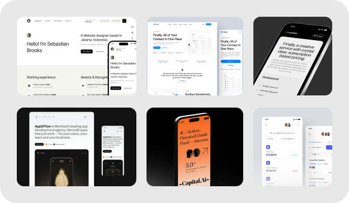
Description: Focuses on a simple, uncluttered look with a lot of white space and minimal design elements.
Benefits: Enhances clarity and readability, improves performance by reducing unnecessary elements.
- Tip: Use white space effectively to emphasize important content. Keep designs clean and focused.

04. Dark Mode
- Examples: Twitter, YouTube
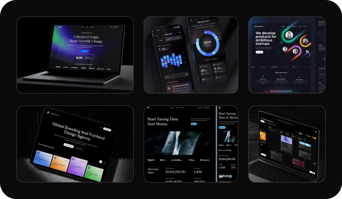
Description: Utilizes dark backgrounds with light text for a sleek, low-light-friendly user experience. Benefits: Reduces eye strain in dim environments, conserves battery life on OLED screens, and offers a modern, stylish appearance.

05. Responsive Design
- Examples: Bootstrap, ZURB Foundation
Description: Adjusts a website's layout based on the user’s device, providing a seamless experience on various screen sizes. Benefits: Enhances usability, improves SEO, and ensures a consistent user experience across devices.


 Popular UI Patterns and Graphic Styles in Modern Web Design